
I have started building a CSS framework more times than I want to admit. This one is finished and published: MaverickWave, a lightweight responsive framework.
Why another CSS framework
There is no shortage of them. Bootstrap, Tailwind, Bulma, Foundation, and a long tail behind those. I built one anyway because I wanted a specific balance: small enough not to bloat a side project, but complete enough that I am not writing a modal from scratch again. Loose enough to bend to whatever design I had in mind, instead of a framework I spend my evenings arguing with.
The other reason is that you learn a thing properly by building it. I know more about CSS architecture after four weeks of this than after years of using other people’s frameworks.
The start-stop cycle
If you have ever abandoned an ambitious side project, you know the loop:
- Get inspired and start coding
- Make good progress for a few hours
- Realize how much work remains
- Feel overwhelmed and shelve the project
- Repeat a few months later
Each round got me a bit further and taught me a bit more, and each round hit the same wall. The number of components, edge cases and browser quirks a framework has to survive is not side-project sized.
What AI did, and what it did not
ChatGPT and Claude are what broke the cycle, but not by writing the framework. The split looked like this:
- I designed the architecture and the component structure
- I set the design principles and the aesthetic direction
- AI generated initial boilerplate for some components
- I modified, refined and often completely rewrote that code
- I tested responsiveness across devices by hand
- I built a showcase covering every component
About 80% of the final code needed real manual work after step 3. Color schemes, spacing systems and responsive behaviour all did. AI can scaffold a button. It cannot tell you how that button behaves inside a modal, how it sits in the grid, or whether its contrast still holds when the theme flips.
Responsiveness was the worst of it. Generated CSS tends to look right at whatever width you happen to have open and fall apart at the next one. Most of my hours went into media queries and into making components degrade sensibly.
How it is built
CSS variables for theming
Everything themeable is a custom property:
:root {
  --mw-primary-color: #1031bb;
  --mw-secondary-color: #bb3110;
  --mw-dark-page-background: #0b111a;
  --mw-light-page-background: #d0d2db;
  /* other colors ... */
}
Override them in your own CSS and the look changes without you touching the framework.
Mobile first
Components are written for phones and scale up from there. The grid, the navigation components and the cards all move across breakpoints.
Dark mode
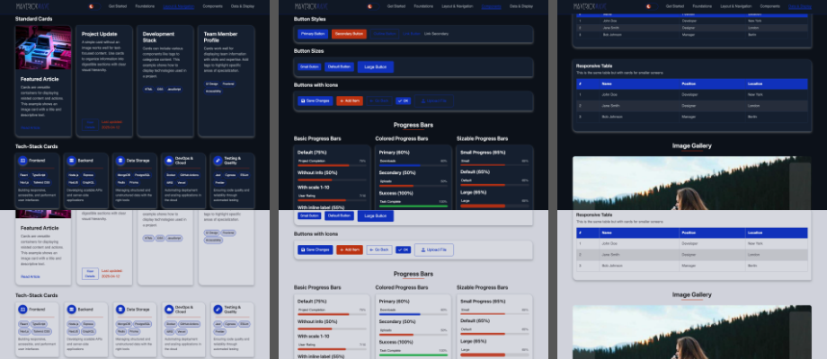
Dark mode sits in the core rather than on top of it. The theme toggle in the header switches with a transition and the components follow. The main header keeps its dark look in both themes, which is a decision and not an oversight.
Minimal JavaScript
Tabs, accordions and the image gallery need JavaScript. The rest does not, and the whole JS bundle is a few KB. Progressive enhancement, rather than components that die without a script.
What is in it
The grid does 2 to 5 column layouts that respond on their own, plus auto-grid and flex-grid for the cases where you do not want to count columns.
Cards are the part I am happiest with: standard, stack, large and extra-large variants, with support for images, content and footers.
For navigation there are tabs in horizontal, vertical and pills style, accordions and list components. The usual UI pieces are there too: buttons, progress bars, spinners, avatars, tags, alerts and counters. For data there are tables, including a card-based variant that stays readable on a phone, and the image gallery.
What four weeks taught me
- Start with the core components and expand from there. Early on, momentum beats coverage.
- Settle naming conventions and design patterns before you have 40 components, not after.
- Test across devices constantly. A responsive bug that sits in the codebase for a week gets copied into five more components.
- AI speeds up parts of the work and replaces none of the judgment, least of all on design and UX.
- Write the documentation next to the components. Nobody can use what is not written down.
Four weeks, and for once I finished something I had shelved half a dozen times. The code is in the GitHub repository, and the live showcase has every component on one page. Feedback and pull requests welcome.